PREMIUM LOGIN
ClassTools Premium membership gives access to all templates, no advertisements, personal branding and many other benefits!
| Username: | ||
| Password: | ||
|
Submit
Cancel
|
||
| Not a member? | ||

PREMIUM LOGIN
ClassTools Premium membership gives access to all templates, no advertisements, personal branding and many other benefits!
| Username: | ||
| Password: | ||
|
Submit
Cancel
|
||
| Not a member? | ||

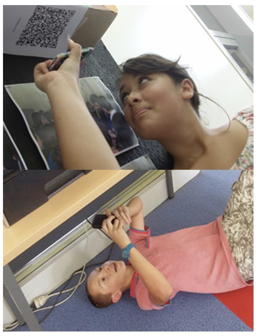
1. Arrange students into groups. Each group needs at least ONE person who has a mobile device.
2. If their phone camera doesn't automatically detect and decode QR codes, ask students to
4. Cut them out and place them around your class / school.
1. Give each group a clipboard and a piece of paper so they can write down the decoded questions and their answers to them.
2. Explain to the students that the codes are hidden around the school. Each team will get ONE point for each question they correctly decode and copy down onto their sheet, and a further TWO points if they can then provide the correct answer and write this down underneath the question.
3. Away they go! The winner is the first team to return with the most correct answers in the time available. This could be within a lesson, or during a lunchbreak, or even over several days!
4. A detailed case study in how to set up a successful QR Scavenger Hunt using this tool can be found here.
Question | Answer |
| 1. Balance | The page is laid out in a planned and coherent visual pattern | 2. Balance2 | "The visual elements are not out of proportion or heavy in one area" 2 | 3. Color Theory3 | The idea that colors can affect human thought and emotions 3 | 4. Color theory4 | Colors may be visually pleasing or may make someone feel uncomfortable.4 | 5. Contrast 5 | Similar to emphasis it separates elements by comparing or creating differences5 | 6. Contrast 6 | Can be achieved through the use of color , size , shapes , and location .6 | 7. Emphasis 7 | Making a specific element stand out.7 | 8. emphasis 8 | achieved by using color, size, location, or shapes. 8 | 9. Emphasis 9 | Making a specific element stand out.9 | 10. lines 10 | Lines can be curved, horizontal, vertical, diagonal, wavy, dashed, or dotted10 | 11. lines 11 | every line has length, thickness, and direction11 | 12. Lines12 | The basic component of a shape12 | 13. Movement 13 | Directing the eye in a certain direction.13 | 14. Movement 14 | Achieved through the use of dots, arrows, or lines14 | 15. movement15 | directing the eye in a certain direction15 | 16. Proximity 16 | The closeness of distance from text and graphics16 | 17. proximity 17 | Close proximity indicates a connection, such as placing a caption on a graphic17 | 18. Rule of Thirds18 | The theory that the most interesting components of a composition, like a web page, is found off-center18 | 19. Shapes19 | Shapes can be geometric, such as a square or a circle19 | 20. Shapes20 | A line that defines or implies a boundary 20 | 21. shapes21 | shapes may also be also be organic21 | 22. Symmetry 22 | Symmetry can be vertical, horizontal, or radial22 | 23. Symmetry 23 | When the composition of the text and graphics is evenly distributed around a center point23 | 24. Textture24 | A fill used in shapes to imply what object may feel like24 | 25. Texture25 | The texture may, for example, look rough or wavy25 | 26. White Space26 | Includes Margins, padding, and line spacing26 | 27. White Space27 | Areas of the page that do not have text or graphics 27 | 28. Unity 28 | Creating a feeling of wholeness28 | 29. Unity 29 | Achieved by using the same color or different tints of that color29 | 30. Alignment 30 | The spacing of text and graphics in relation to one another or the margins on a page30 | 31. Alignment 31 | Common alignments: center, left, right, and justify31 |

Question 1 (of 31)

Question 2 (of 31)

Question 3 (of 31)

Question 4 (of 31)

Question 5 (of 31)

Question 6 (of 31)

Question 7 (of 31)

Question 8 (of 31)

Question 9 (of 31)

Question 10 (of 31)

Question 11 (of 31)

Question 12 (of 31)

Question 13 (of 31)

Question 14 (of 31)

Question 15 (of 31)

Question 16 (of 31)

Question 17 (of 31)

Question 18 (of 31)

Question 19 (of 31)

Question 20 (of 31)

Question 21 (of 31)

Question 22 (of 31)

Question 23 (of 31)

Question 24 (of 31)

Question 25 (of 31)

Question 26 (of 31)

Question 27 (of 31)

Question 28 (of 31)

Question 29 (of 31)

Question 30 (of 31)

Question 31 (of 31)