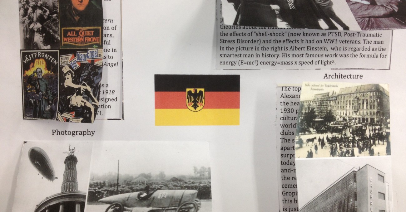
When producing a display poster summing up several ideas, students should identify a ‘cover image’ for each main part of the piece. This should be ‘lifted up’ to expose the written detail. See the image for an idea of how this works.
Taking it further: An even simpler method is to take a piece of A4, fold it in half to create a greeting card, and place the image on the front with the written information inside. I have done this when Year 8 researched the origins of superstitions: a bold illustration on the front (e.g. of a four leafed clover) and an explanation on the front. A class collection of these forms a good display.


